Redesign Trouw online
Trouw is a national newspaper
Country: The Netherlands
Subscribers: 114.600
Average reading time: long
Launch of our new website and apps: June 25, 2019
Main changes
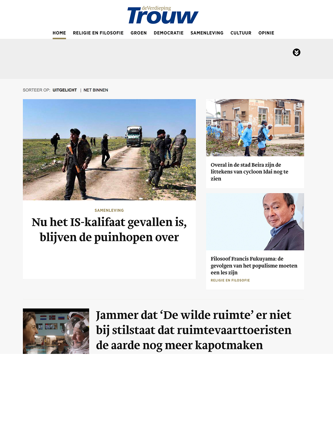
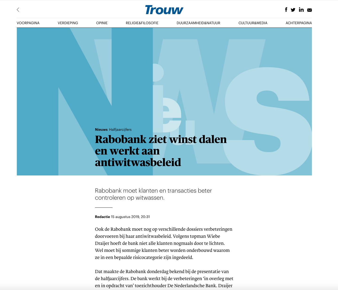
– We’ve changed our image philosophy. We use fewer photos. No image unless it’s a good image. So sometimes no photo. In a world where every article is illustrated with photos (often small, stock photos), the reader easily gets lost. To create more calm, we have developed a new online language, with more colour, shape and typography. For us, good photography is not always available, we have to deal efficiently with costs and time. With typographic illustrations we have created a solution for more abstract news topics and opinion articles.
Typographic illustrations as images, as carriers of headlines. This fits in with Trouw’s content, not only news but also investigative journalism and essays.
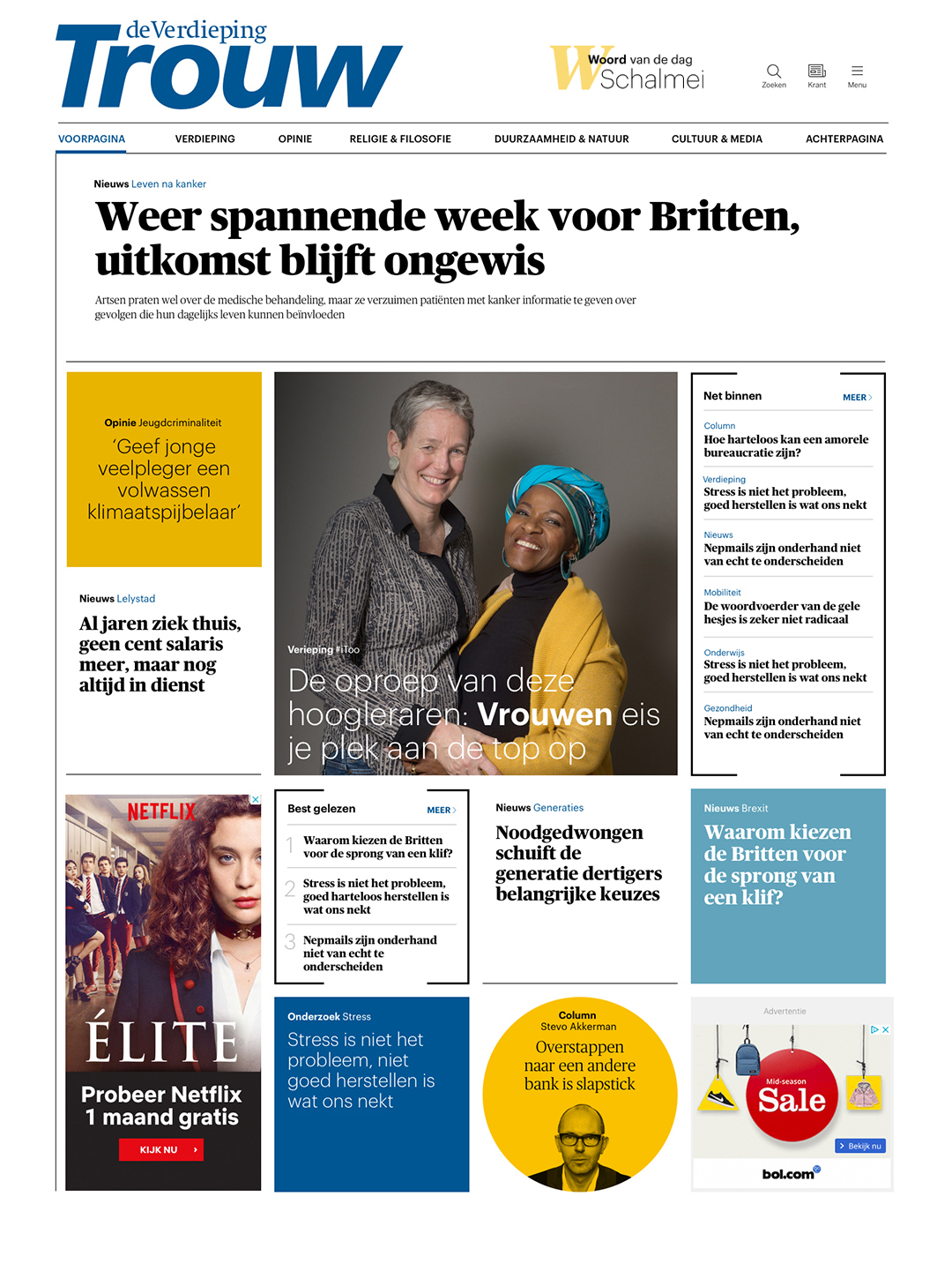
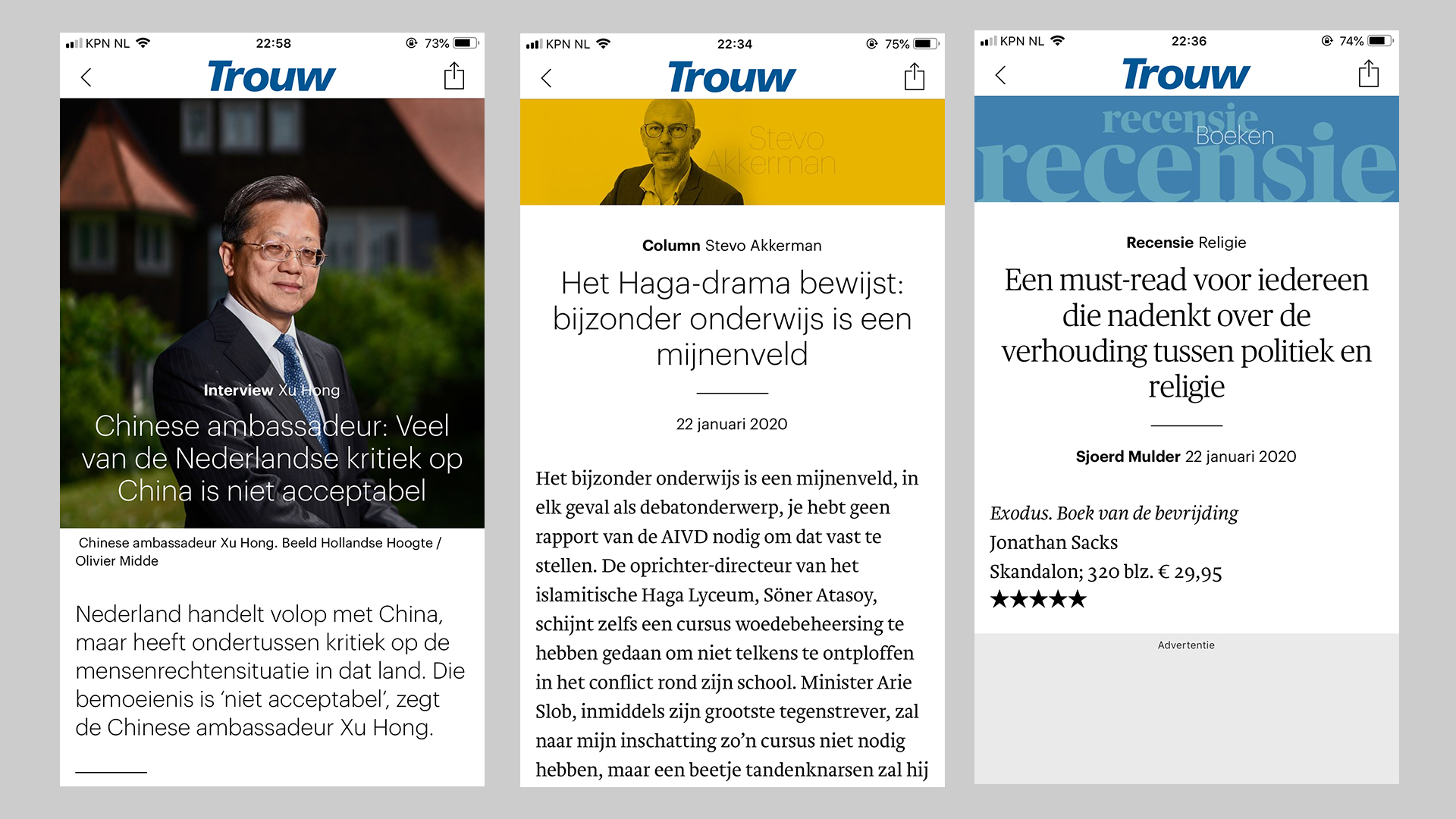
– In site and apps we use two typefaces for headlines, the Publico for news and the Graphik for in-depth articles
– Next to the masthead we added a new element: Word of the day, linked to an article
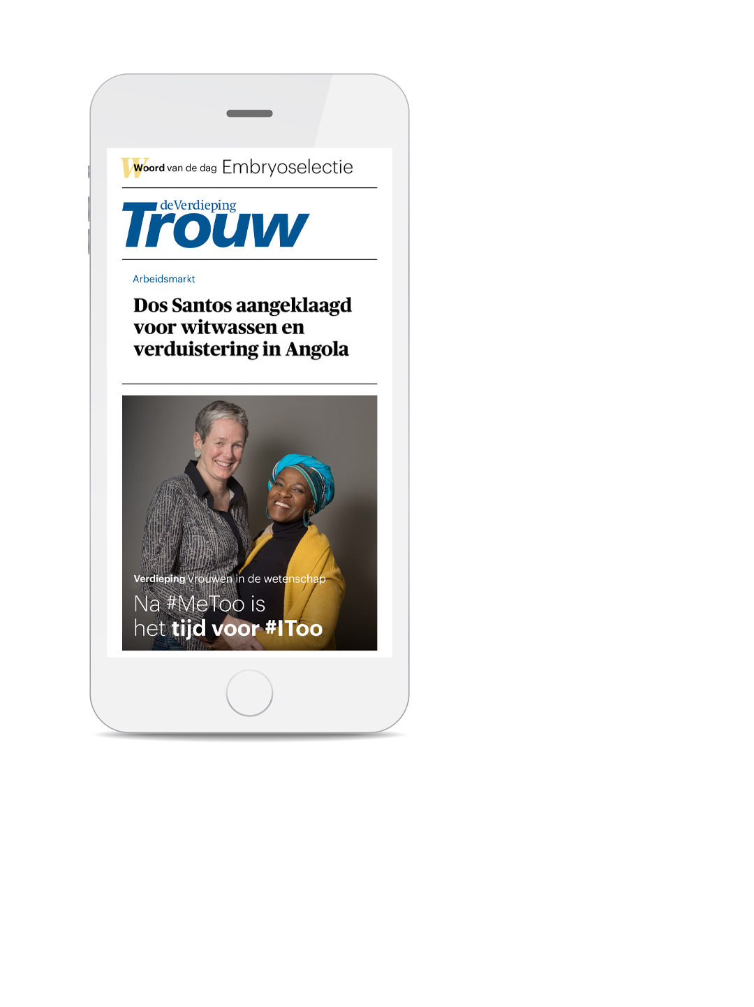
– For Trouw, the tablet app is a new product, the Digital Edition is an online translation of the printed newspaper, published once a day. We had to reinvent the hierarchy of elements, especially since the app is only landscape mode.
The app gives us the opportunity to experiment with animations and slideshows too. Does it add something or is it simply (too) playful, are interesting new questions.
Style guide
Examples article level
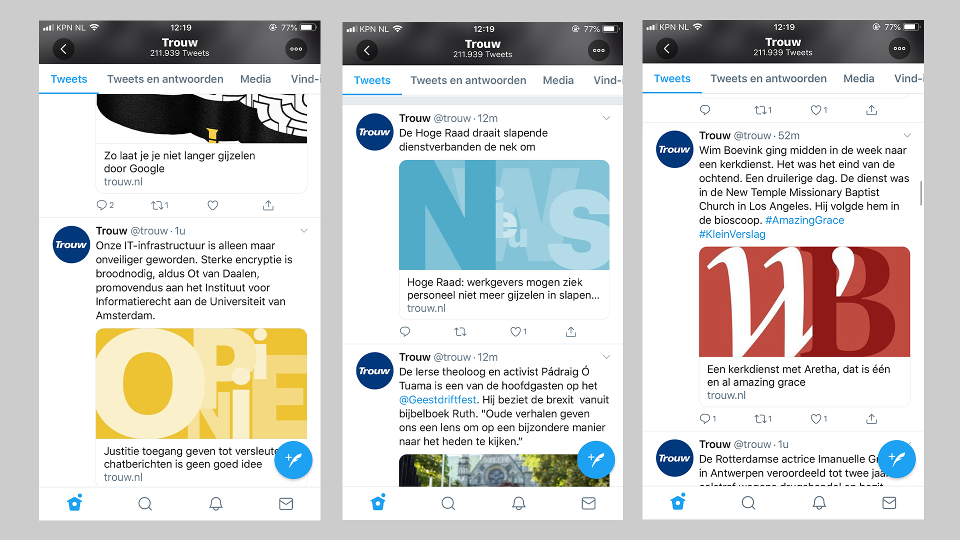
Example Twitter feed
Digital Edition
Volg ons: